
The New Colour Code
After years of black acetate and classic tortoiseshell, colour is making a confident return to luxury eyewear
Luxury has spent the better part of a decade refining the art of restraint. Fashion embraced neutral wardrobes, understated accessories and craftsmanship over decoration.
Eyewear followed the same path. Black acetate remained a constant, tortoiseshell continued to dominate collections and polished metals offered a timeless alternative. While silhouettes evolved from season to season, colour was rarely the defining feature.
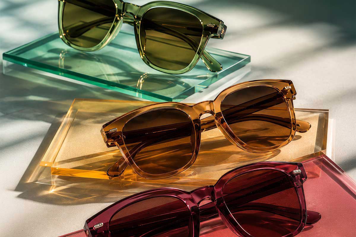
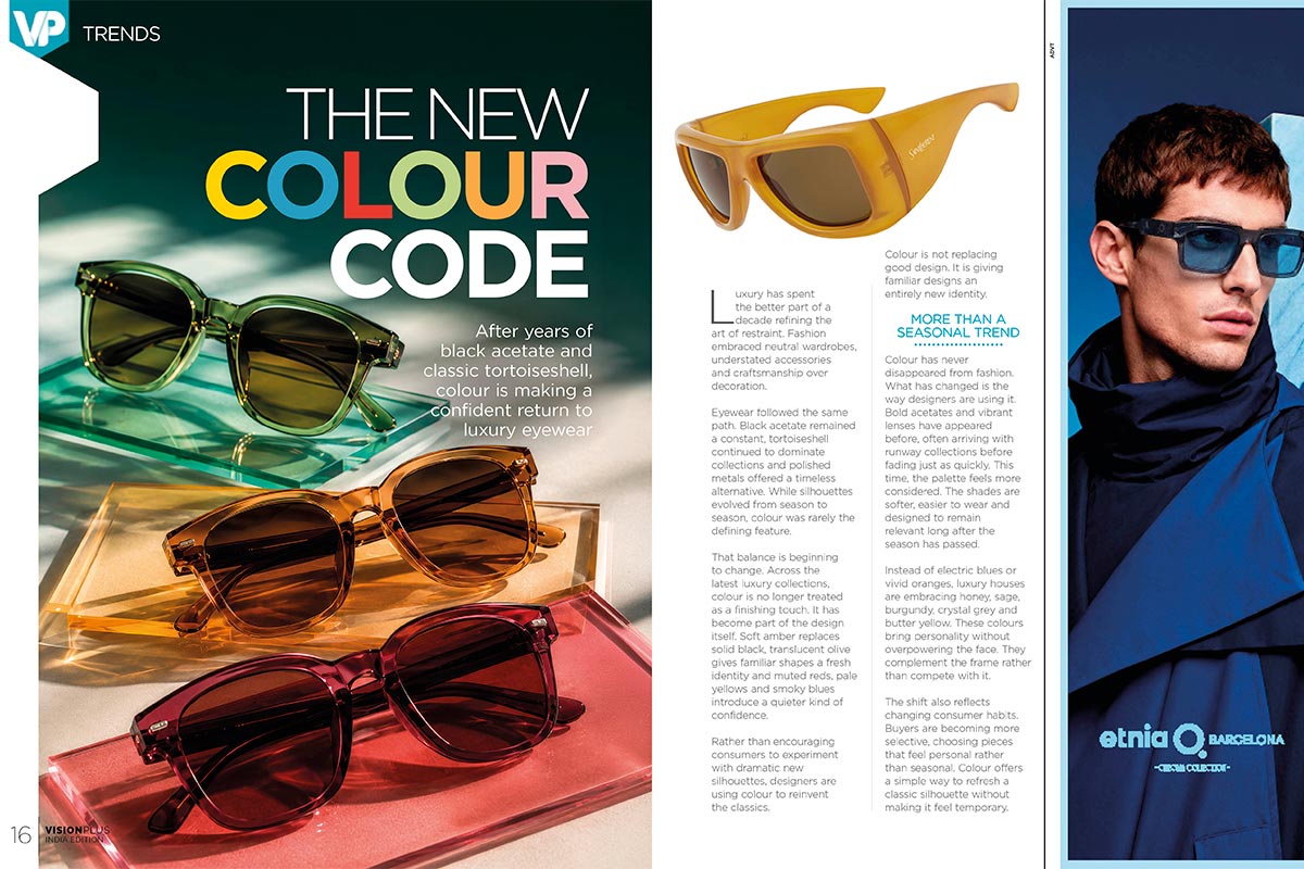
That balance is beginning to change. Across the latest luxury collections, colour is no longer treated as a finishing touch. It has become part of the design itself. Soft amber replaces solid black, translucent olive gives familiar shapes a fresh identity and muted reds, pale yellows and smoky blues introduce a quieter kind of confidence.
Rather than encouraging consumers to experiment with dramatic new silhouettes, designers are using colour to reinvent the classics.
Colour is not replacing good design. It is giving familiar designs an entirely new identity.
More Than a Seasonal Trend
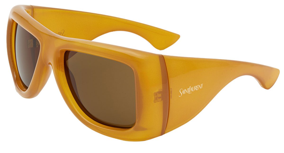
Colour has never disappeared from fashion. What has changed is the way designers are using it. Bold acetates and vibrant lenses have appeared before, often arriving with runway collections before fading just as quickly. This time, the palette feels more considered. The shades are softer, easier to wear and designed to remain relevant long after the season has passed.
Instead of electric blues or vivid oranges, luxury houses are embracing honey, sage, burgundy, crystal grey and butter yellow. These colours bring personality without overpowering the face. They complement the frame rather than compete with it.
The shift also reflects changing consumer habits. Buyers are becoming more selective, choosing pieces that feel personal rather than seasonal. Colour offers a simple way to refresh a classic silhouette without making it feel temporary.
When Colour Changes the Shape
A frame does not always need a new silhouette to feel new. One of colour’s greatest strengths is its ability to change the way a shape is perceived.
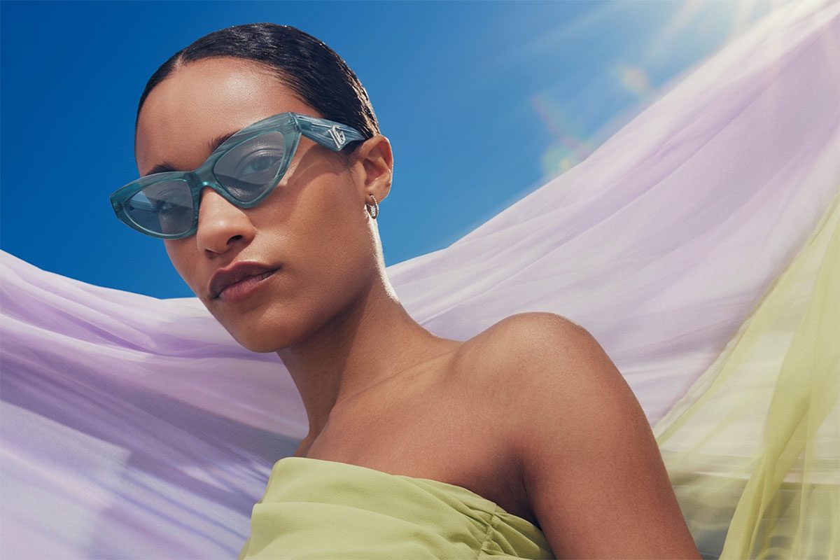
The same rectangular frame appears softer in translucent champagne than it does in solid black. An oversized cat eye feels lighter in olive green, while a sculptural acetate takes on an entirely different character in deep cherry or warm caramel.
The silhouette remains the same, yet the impression changes completely.
That gives designers greater freedom. Rather than reinventing successful shapes every season, they can reinterpret them through carefully considered palettes, allowing familiar designs to evolve naturally. For consumers, it also makes experimentation less intimidating. Choosing a new colour often feels easier than committing to a completely different frame shape.
The Rise of Transparent Acetates
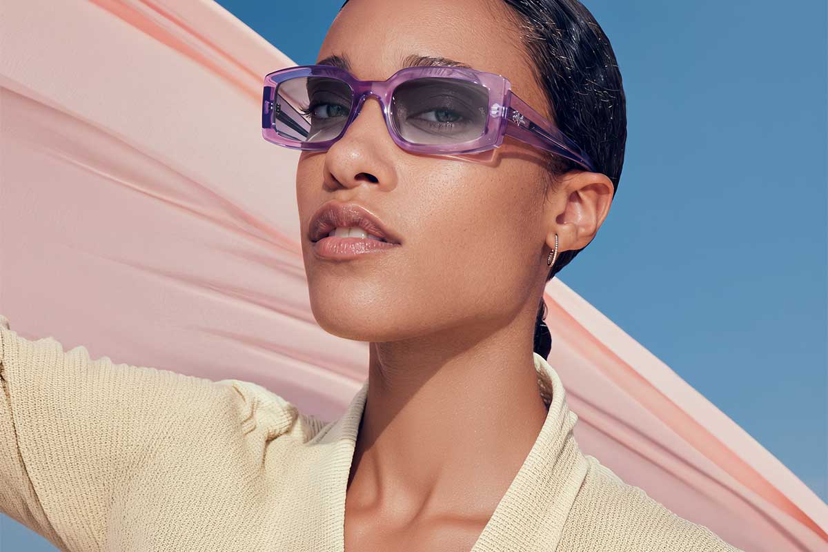
Perhaps nowhere is this more evident than in transparent materials. Clear frames have been around for years, but luxury eyewear is exploring transparency with far greater sophistication. Instead of completely colourless acetates, designers are layering subtle pigments into crystal-like finishes that create depth without adding visual weight. Smoke grey, pale tea, soft rose and translucent olive allow light to pass through the frame, revealing details that opaque acetate often conceals. Construction, hardware and sculptural lines become part of the overall aesthetic.
The result is eyewear that feels lighter, more contemporary and remarkably versatile.
These frames work across different skin tones, adapt easily to changing wardrobes and offer an alternative to traditional neutrals without feeling overtly fashion-driven.
Beyond the Frame
Colour is influencing lenses as well. For years, grey and brown remained the default choice for premium sunglasses, valued for their practicality and versatility.
While those classics continue to hold their place, softly tinted lenses are beginning to reshape the conversation.
Amber, rose, smoke green and pale blue are appearing across luxury collections not as novelty features, but as considered design choices. They introduce warmth, softness or contrast without distracting from the frame itself.
Rather than becoming the focal point, the lens now works alongside the frame to complete the overall design.
What was once associated with vintage styling now feels entirely contemporary.
Colour Becomes Personal
Perhaps the biggest reason behind this shift is the way people now approach eyewear. A single pair of glasses is no longer expected to do everything. Much like shoes or handbags, eyewear has become part of a personal wardrobe.
One frame may be chosen for work, another for weekends and another simply because it reflects a different mood or personality. Colour fits naturally into that way of thinking. Someone who has worn black frames for years may discover that translucent brown feels softer against the skin.
Another may choose burgundy instead of tortoiseshell or olive instead of matte black. They are subtle changes, yet they transform the way a frame looks and feels. That sense of individuality has become one of luxury eyewear’s greatest strengths.
What It Means for Retail
For optical retailers, colour opens the door to new conversations. Customers often gravitate towards familiar choices simply because they have never been encouraged to explore anything else. Displaying coloured acetates alongside classic black frames allows them to compare not only different styles, but different moods and personalities.
The same applies to tinted lenses. Once viewed as purely fashionable, they are increasingly appreciated for the atmosphere they bring to a pair of sunglasses, creating a look that feels considered rather than conventional. Helping customers understand these differences turns colour from an impulse decision into a confident one. Today, colour is becoming just as influential. Luxury eyewear will always be defined by craftsmanship, proportion and material.
Now, colour has joined that conversation, not as an accent, but as an essential part of the design itself. For years, shape defined the way we looked at eyewear.
colour is proving just as powerful, showing that sometimes the biggest transformation comes not from a new silhouette, but from seeing a familiar one in an entirely different shade.